
Brand Identity Design
construction
Skills
Artistic Direction,
Adobe Illustrator,
Graphic Design,
Logo Design
Summary
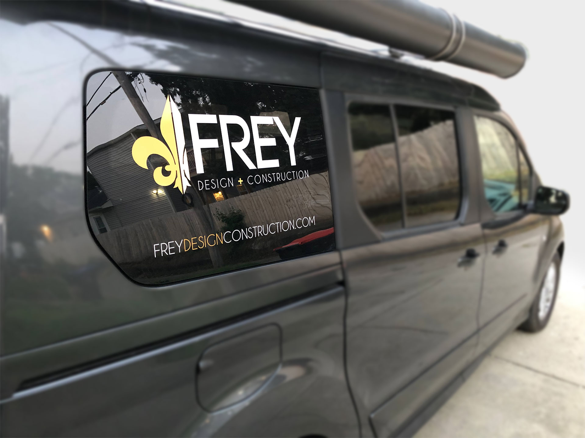
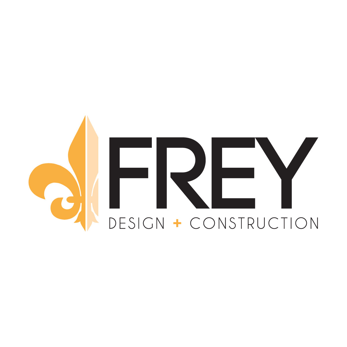
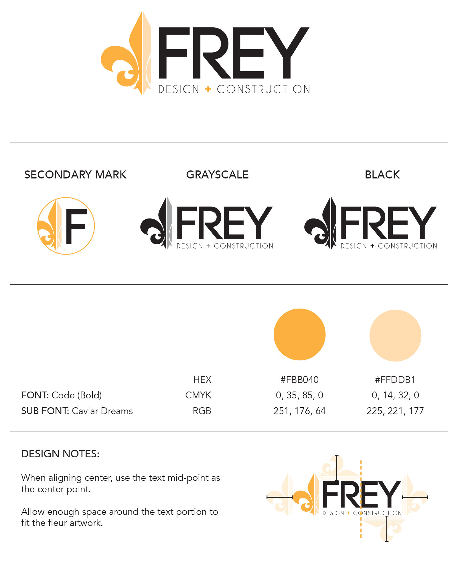
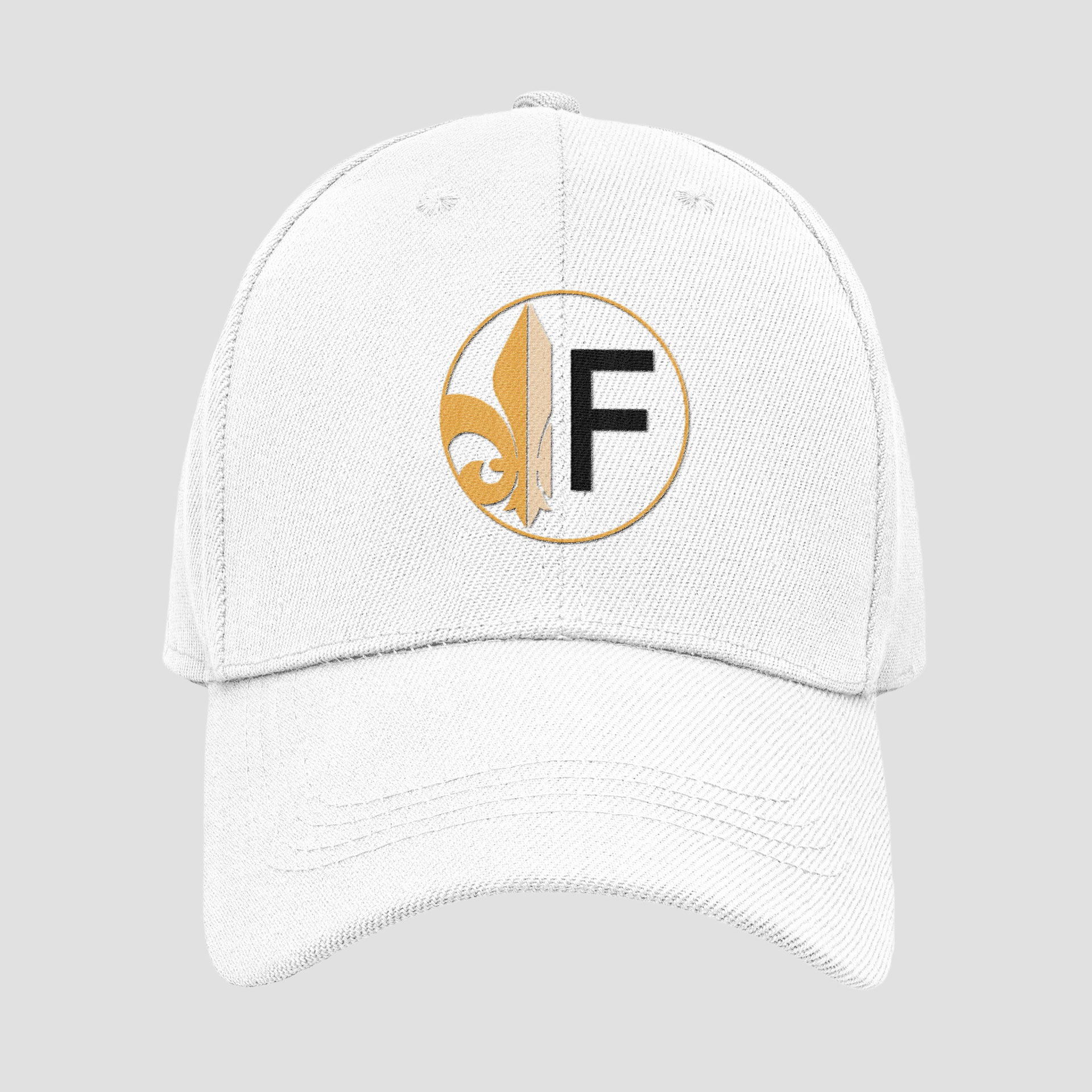
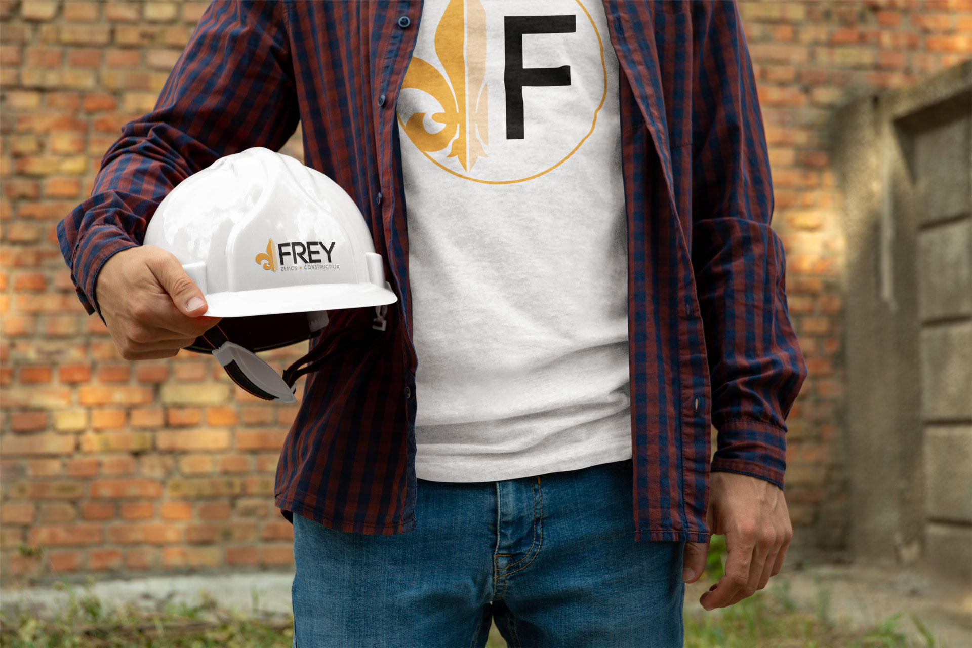
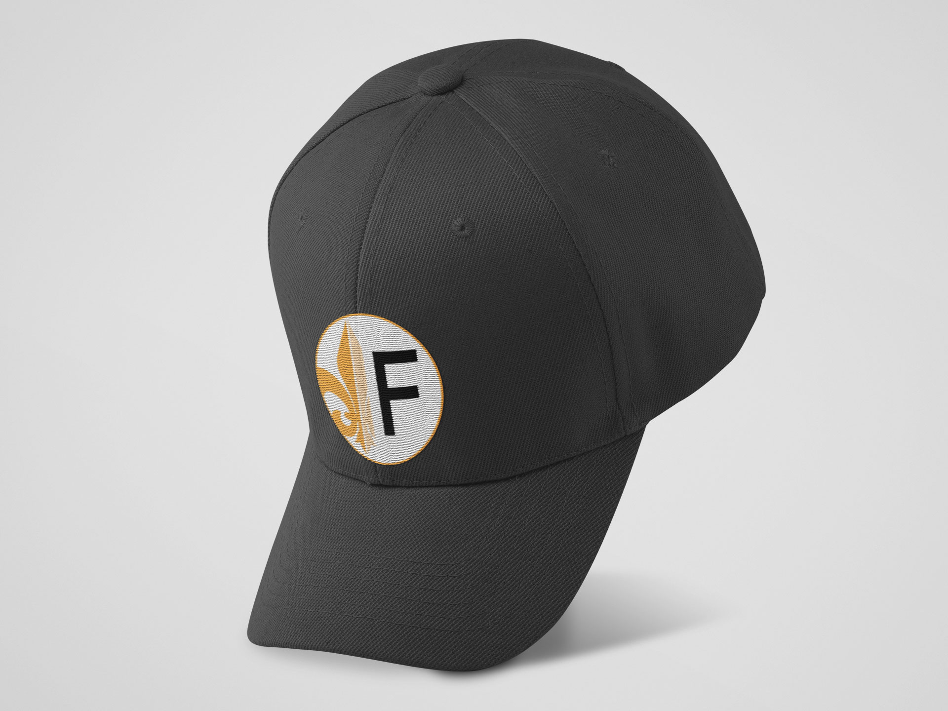
Design Concept The logo for Frey Design & Construction was designed to convey a sense of precision, sophistication, and warmth. With the client’s unique combination of design and construction services, the goal was to create a brand identity that set him apart from other contractors in the Louisville area. The fleur-de-lis, a symbol deeply tied to Louisville’s French heritage, was chosen as the central design element, grounding the logo in local culture while adding a touch of elegance.
Visual Elements The design features crisp, clean lines that reflect the company’s meticulous and detail-oriented approach to his work. A warm orange hue was selected to represent the energy and passion the client brings to every project. The color choice not only adds vibrancy but also creates a welcoming and dynamic brand image. The plus symbol was used in place of “and” as a nod to his work being a level above the norm.
Symbolism and Impact The integration of the fleur-de-lis lends a timeless and regional significance to the logo, reinforcing a strong connection to Louisville’s identity. This symbol, paired with the clean and modern aesthetic, effectively communicates the high standards and innovative services offered by Frey Design & Construction, ensuring the logo stands out among competitors in the area.
